
KLIGO · Source of truth
Developer Kit
Start here
Technical guides are in English. The website supports English, Hebrew and Arabic.
- Download and extract. The complete project contains the website source, assets, translations, technical guides and tests.
- Open START_HERE.md. Follow setup from the
kligo-website/folder. Node 22.13+ and Bash are required; Windows users should use WSL2. - Review the demo boundaries below. Read the confirmed scope and remaining checklist before connecting real accounts, records or billing.
Confirmed scope: Website first; all four categories; new materials and site surplus. KLIGO charges for subscriptions and paid placements only. Buyers and suppliers arrange and pay for their deals directly. Read LAUNCH_SCOPE.md for the full brief.
Source snapshot only: no Git history, hosting access, credentials or native app binaries. Font configuration is included; font files load externally.
Package details and optional component kit
The complete project already includes the design-system sources. The smaller kit is an optional component reference and cannot run by itself.
Download component kitEach ZIP includes an export manifest identifying its contents. Download links work independently of package metadata.
Repository access is arranged separately by the project owner. This page does not grant it. A Figma file is optional and is not required to use the source.
What works now—and what needs building
Interactive prototype. The items below are implementation references, not live commercial services. Expand a feature for its current behavior, remaining work and business decision.
Find equipment, services, parts and materials
- Available in the prototype
- Search, filters, listing cards and maps work with sample inventory and locally published listings. Map locations are approximate. Materials separates new stock and site surplus, with translated lot details and source selection on the seller form.
- Developer work
- Connect shared inventory, verified locations and the approved maps/geocoding service.
- Scope / remaining decision
- Confirmed: all four categories launch on the website. Confirm initial geography.
- Source reference
- components/marketplace/
Accounts and company profiles
- Available in the prototype
- Registration, recovery and profile screens demonstrate the account journey. Public prototype access does not create a real customer account.
- Developer work
- Real sign-in, verified contacts, account recovery, company membership and server-enforced permissions.
- Scope / remaining decision
- Who may register, and who approves a company?
- Source reference
- components/profiles/; app/create-account/
Create and manage listings
- Available in the prototype
- Create, edit, publish and pause listings in browser-local demo state. Photos are resized in the browser.
- Developer work
- Durable records, owner permissions, image storage, moderation and cross-device access. Persist material source (new/surplus), remaining quantities and sold-out status.
- Scope / remaining decision
- Which listings require approval before publication?
- Source reference
- components/provider/listing-session.ts
Requests, quotes and direct provider deals
- Available in the prototype
- Request, quote and historical booking screens use sample/local records. No real provider receives a request or payment.
- Developer work
- Deliver and persist real inquiries and responses. Adapt historical booking/payment screens for direct provider deals; KLIGO does not take payment, commission or manage fulfilment for these deals.
- Scope / remaining decision
- Confirmed: parties arrange and pay for deals directly. Confirm which request/quote status tracking is needed.
- Source reference
- components/customer/; components/provider/
Messages and support
- Available in the prototype
- Company-specific demo conversations, support examples and local drafts are available. Messages are not delivered to real people.
- Developer work
- Private conversations, real delivery, attachments, notifications and an assigned support queue.
- Scope / remaining decision
- Who answers support, and which notifications are needed at launch?
- Source reference
- components/customer/company-contact.ts
Saved items, reviews and reports
- Available in the prototype
- Saved items persist in this browser. Ratings come from sample reviews. Reports remain unsent local drafts.
- Developer work
- User-owned saved lists, eligible real reviews, server-checked reporting and staff moderation.
- Scope / remaining decision
- Who verifies companies, handles reports and approves reviews?
- Source reference
- components/customer/saved-store.ts; components/profiles/provider-reviews.tsx
Subscriptions and paid placements
- Available in the prototype
- All 15 placements have 7-, 14- and 30-day demo prices. Billing and plans link to Advertise. A single checkout summary handles subscriptions, listing packs and ads, with Hebrew/Arabic copy and local confirmation only. No real charge or entitlement is created.
- Developer work
- Implement subscription and paid-placement billing, verified payment events, entitlements, placement delivery/expiry, invoices and billing support. No seller payouts or buyer-deal checkout.
- Scope / remaining decision
- Confirmed: these are the only KLIGO revenue streams. Approve prices and billing rules; business team handles marketing execution.
- Source reference
- components/provider/checkout-order.ts; components/provider/ad-placements.ts
Performance reports
- Available in the prototype
- Charts and metrics are demonstration data.
- Developer work
- Define and collect real events, protect privacy, remove duplicates and calculate reports from stored records.
- Scope / remaining decision
- Which outcomes matter for the first release?
- Source reference
- components/provider/
Languages and mobile
- Available in the prototype
- Responsive web screens in light and dark modes with a saved appearance choice, plus English, Hebrew and Arabic presentation. Native app source is not included.
- Developer work
- Independent language/RTL acceptance, production locale/SEO handling and a separate native application if commissioned.
- Scope / remaining decision
- Confirmed: website first; native application later. Confirm language acceptance for launch.
- Source reference
- components/i18n/; docs/MOBILE_APP_HANDOFF.md
Guides and checklists
Read here or download. Checklist items describe work to verify; this page does not record approvals or completion.
Start hereDownload choice, setup commands, folders and demo boundaries.
Confirmed launch scopeWebsite first, all four categories, subscriptions and paid placements only.
Materials: new and surplusSource groups, seller fields, translations and remaining backend work.
Light and dark appearanceBoth themes, saved preference, shared surfaces, maps, controls and acceptance checks.
Images and carousel dotsPaired day/night equipment assets, theme-aware rendering and unframed carousel controls.
Checkout and advertisingPlacement prices, checkout steps, translations and production billing requirements.
Readiness and decisionsWhat is supplied, what remains and what Viktor needs to decide.
Feature statusThe same current behavior, remaining work and decisions shown above.
Current pagesGenerated route list, source files and redirects.
Development checklistPhased tasks and acceptance criteria. Unchecked items are not completed work.
API and permissionsProposed server operations and access rules for developer review.
Data and migrationsProposed stored records and database migration approach.
Mobile applicationWhat can be reused for a separate native application.
Hebrew implementationTranslation structure and remaining independent review.
Arabic implementationArabic copy, search, counts, fonts and RTL behavior.
Detailed implementation referenceExisting storage, interaction and component behavior in greater detail.
01 · Brand
Approved logo system
These are the exact supplied vectors. KLIGO is never recreated with a font, cropped, stretched or recolored.


Complete vector library
All 19 supplied logo assets are preserved and named by approved use.
















Primary use: full-primary.svg on white. Use the supplied black, yellow or reversed file when the surface changes—never apply CSS recoloring.
02 · Color
Yellow signals action. Black carries authority.
The official vectors lock the brand colors at #FBB104 and #0A0A09. Earlier approximations are retired.
KLIGO yellow#FBB104
KLIGO black#0A0A09
Warm surface#F6F6F3
Muted text#71716A
Dark background#111111
Dark card#171717
Success#2F6B46
Destructive#B4231D
Light and dark appearance
Switch the entire website to inspect every screen and component. Your choice is remembered on this browser.
Light mode
- Canvas
- #FFFFFF
- Card
- #FFFFFF
- Text
- #0A0A09
- Muted text
- #71716A
Dark mode
- Canvas
- #111111
- Card
- #171717
- Text
- #F4F4EF
- Muted text
- #B9B9B1
Charcoal backgrounds, bright readable text and the same KLIGO yellow. Logos use the supplied reversed artwork. Photography keeps its original colors.
03 · Materials
Four surface recipes for every KLIGO screen.
The material system controls background, border, radius and elevation. Pages compose these recipes instead of inventing new visual treatments.
White workspace
#FFFFFF · flat · structural border only
Action surface
16px radius · 0 6px 16px / 8%
Warm utility surface
#F6F6F3 · filters, grouped fields, states
Authority panel
#0A0A09 · white content · yellow signal
Control radius
16px
Panel radius
24–28px
Control shadow
0 6 16 / 8%
Large-card shadow
Restrained, never decorative
Spacing scale
4px
8px
12px
16px
24px
32px
48px
64px
Use 8px as the working rhythm; 24px is the default control padding and section gaps expand deliberately to 32, 48 or 64px.
04 · Typography
Operational clarity with construction weight.
Heebo creates the strong display silhouette. Assistant carries readable interface and multilingual body copy.
Heebo · 800
Built for the work ahead.
Display headings · 48–72px desktop · 40–52px mobile
Assistant · 400–700
Find verified equipment owners, rental companies and construction-service providers based on the job, location and timing.
Body 16–18px · Labels 14px · Metadata 12–13px
05 · Navigation
One hierarchy across desktop and mobile.
The live header above is the canonical public navigation pattern. The Developer Kit remains directly accessible during development.
Reuse MarketplaceMenu for the single Browse dropdown. The current section appears beside it, follows the URL and remains correct on detail pages and refresh. Category tabs belong beside Browse Categories, never inside the search form. The mobile header uses the compact variant; both versions support keyboard navigation and RTL.
Default
Equipment
Hover
Equipment
Active
Equipment
CTA
Request quote
07 · Controls
Essential controls use the same surface language.
Tabs, pagination, selection, chips and view toggles follow the exact black, yellow and white hierarchy shown in the approved references.
Reusable component API
The same exported controls power search, filters, pagination and view selection across parallel workstreams.
Search and filter
Segmented tabs
Pagination / steps
Selection / check
List / grid view
Filter chips / pills
Category chips
Language switch
Header states
Status tabs and Plans menu
Selected status: received. Rows expand to fit labels; active controls use black with yellow text.
Plans opens Plans, Billing and Badges from the same menu in each workspace. Menu items retain one clickable link through translation; use DropdownMenuItem → KButton → Link. Arrow keys navigate, Escape closes and restores focus.
Price range and filters
KFilterPopover composes the installed popover. KPriceRangeFilter composes Radix slider with separately labelled handles, numeric inputs and RTL support. No invented price-distribution chart.
Search and map discovery
Catalog suggestions, location recommendations and a flat calendar. Only range endpoints use solid yellow; days have no raised shadows. Advanced filters open below their Filters button. Dates remain requests until confirmed.
Open map example08 · Icons
Approved functional icon library.
Only these clear, outline-style interface icons are approved at this stage. New icons are added here before they enter a page.
Home
Active · inactive
Menu
Active · inactive
More actions
Active · inactive
Search
Active · inactive
Filter
Active · inactive
Settings
Active · inactive
Back
Active · inactive
Next
Active · inactive
Expand
Active · inactive
Close
Active · inactive
Add
Active · inactive
List
Active · inactive
Grid
Active · inactive
Map
Active · inactive
Calendar
Active · inactive
Equipment
Active · inactive
Contractors
Active · inactive
Business
Active · inactive
Parts
Active · inactive
Materials
Active · inactive
Supply search
Active · inactive
Company
Active · inactive
Location
Active · inactive
Verified
Active · inactive
Success
Active · inactive
Alert
Active · inactive
Favorite
Active · inactive
Save
Active · inactive
Share
Active · inactive
Download
Active · inactive
Upload
Active · inactive
Camera
Active · inactive
Message
Active · inactive
Call
Active · inactive
Active · inactive
Profile
Active · inactive
Follow
Active · inactive
Edit
Active · inactive
Save changes
Active · inactive
Notifications
Active · inactive
Quote
Active · inactive
Support
Active · inactive
FAQ
Active · inactive
Report
Active · inactive
Language
Active · inactive
Secure
Active · inactive
Sign out
Active · inactive
Delete
Active · inactive
09 · Forms
Short fields, direct requests, visible states.
Forms collect only information needed to route a request. Labels stay visible and errors never depend on color alone.
Saved views, customer reviews and reporting
SavedWorkspace uses one persistent shortlist for its grid and compact list. Layout is a separate device preference; category filters and removal/undo work in either view. ProviderReviews calculates its average and distribution from the displayed records; no reviews means no rating. Catalog summaries and the rating filter use the same records. Demo feedback is never described as verified bookings.
Customer reviews
Demo reviews · illustrative feedback, not verified customer bookings.
4.5/ 5
2 sample reviews
Project manager · demo persona
5 / 5
Commercial foundation works · 12 Aug 2026
Example feedback focused on arrival coordination, operator communication and completing the agreed excavation scope.
Site engineer · demo persona
4 / 5
Utility trenching · 28 Jul 2026
Example feedback showing clear site work and a transport-timing change recorded for the customer.
ListingReportForm serves both report routes. Canonical listing/company data determines the reported party. A saved outgoing demo message or completed provider-specific request records contact in contact-history.ts; profile visits, seeded conversations and query flags do not. Eligibility is rechecked when saving. Reports and filenames remain unsent tab-local drafts. Production must authenticate the reporter and check the actual listing owner and server-owned conversation/request relationship, with moderation and rate limits; client gating is not security.
Settings and support
One quiet settings list links to profile, preferences, security, billing, verification and help. Reuse SettingsHub for each role. AccountPreferences saves device-local alert choices; language uses the global locale. Only supported appearance and permissions are presented. CustomerSupport shares the same FAQ, callback and contact layout with role-specific chat destinations and unsent draft history. Profile editors use associated labels and one save action.
Settings
Billing, badges and campaign clarity
BillingWorkspace is shared by customer and provider roles: summary, payment status, documents, invoices and one billing-details form. Show inclusive totals and preserve the chosen cycle. BadgePlans proposes review fees; a saved request never grants approval. Trusted directory sponsorship stays separate from identity evidence. Campaigns retain their stored budget, metrics and destination; current rate-card prices are shown in placement info dialogs. Production requires approved pricing, secure payments, server-side badge reviews and eligibility checks.
Get a badge
Choose a review. Payment never guarantees approval or buys trust.
Proposed demo fees · VAT included · no charge or application is sent.
Verified
Confirm who runs the business.
Free
Identity review
- Business registration
- Authorized contact and identity
Vetted
Review the business and its operating evidence.
₪199
One-time review fee · sample
- Verified identity
- Insurance and relevant licences
- Equipment or service evidence
Trusted
Review an established record of reliable work.
₪299
One-time review fee · sample
- Vetted business
- Completed-job and customer feedback history
- Review of unresolved complaints
Support request history
Saved requests
Saved in this tab. Nothing has been sent to a support team.
No saved requests yet.
Field states
10 · Cards
Marketplace information before decoration.
Cards prioritize machine, provider, location, trust, commercial model and the next action.
Advertise
Choose where your ad appears and see the full price.
Advertising placement previews
Compare every placement in its page context.
Featured listing
Featured + priority
Search boost
Category boost
Featured map pin
Featured company
Trusted provider spotlight
Company category spotlight
Local company spotlight
Crawler excavator sponsor
Wheel loader sponsor
Earthworks sponsor
Homepage card + category hero
Homepage featured card
Homepage banner
Arabic, Hebrew and right-to-left layouts
Use the reviewed Arabic and Hebrew dictionaries with InterfaceText and localized-controls. Preserve IDs, URLs, form values and user-written content. SeedText translates unchanged demo content only. Search supports English, Hebrew and Arabic; Arabic search ignores vowel marks and supports common equipment names. Use logical spacing, localized dates and Noto Sans Arabic for Arabic text. See docs/ARABIC_LOCALIZATION.md and docs/HEBREW_LOCALIZATION.md for coverage and checks.
ماذا تحتاج؟ · معدات · خدمات · قطع غيار · مواد بناء
מה מחפשים? · ציוד · בעלי מקצוע · חלקי חילוף · חומרי בנייה
Approved mobile templates: two-column photo cards with a black View action, and horizontal white list cards with a status pill and yellow arrow. Photos fill rounded frames without internal padding. Both use #FBB104, actual listing data and the same photo carousel. Mobile actions keep 44px touch targets; category filters sit in two columns. Company cards use a clear logo symbol beside the name. The ellipsis opens save, compare and quote actions in a bottom sheet. Saved list items and mobile map results reuse ListingCard. Mobile saved results show eight items per page. The top mobile header scrolls with the page and its menu closes after navigation.
Mobile discovery rules
Below 768px, category cards and listing grids use two columns (one listing column below 360px). Cards retain swipeable photos, title, location, company, price and availability. Tap the photo or title to open the listing; expand Actions for comparison and quote requests. Extra specifications and sample review text stay on detail pages. List mode uses compact horizontal cards. Sponsored banners use a short image above the offer.
Equipment, services, parts, materials and company searches show at most eight results per mobile page. Home shows four popular listings and four local companies. Filters use the shared bottom Sheet on mobile, with scrollable fields and a fixed Show results action; desktop keeps the anchored popover. Desktop layouts are preserved. The shared bottom navigation and app handoff guide are available in the Mobile section below.

Raised white surface
The same white molded surface as the approved buttons, with internal dividers. Headers use 44px controls; active pages use black with yellow text.
Paid placement
The same yellow molded surface as the approved buttons. Every placement has a price and an accessible visual explanation.
Listing layouts and maps
Grid and map cards share photos, company details, price, availability, specifications and actions. Desktop lists use a separate photo frame and aligned action column.
Services, parts, materials and companies offer map views. Locations are approximate; unknown locations stay in the results. Company logos use circular frames.
Homepage categories and compact listings
Search first, then six visual categories in three desktop columns, followed by compact local demo listings. The entire category is one link. White studio previews are illustrative; original catalog photos stay on listing detail pages. A sponsored card links to its category results with the same eligible listing as a yellow hero, never duplicated among the standard results.
Browse Categories






3.5 t mini excavator
Earthmoving · Tel Aviv–Jaffa
- ₪650
- / day
- Today
- Availability
- 3.5 t class
- Operating class

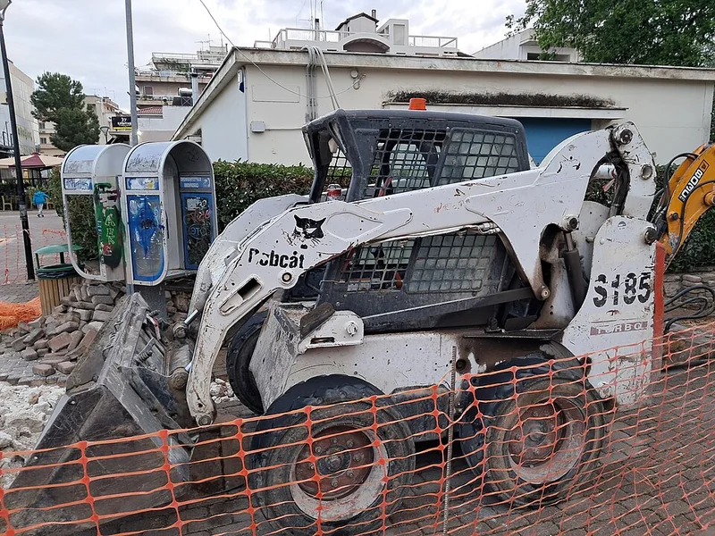
Skid steer loader
Compact equipment · Holon
- ₪540
- / day
- Today
- Availability
- Skid steer loader
- Machine type
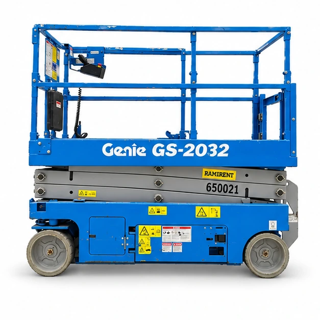
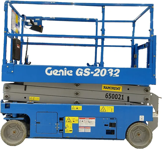
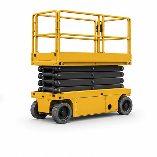
Electric scissor lift
Access · Ramat Gan
- ₪550
- / day
- Today
- Availability
- Electric scissor lift
- Equipment type

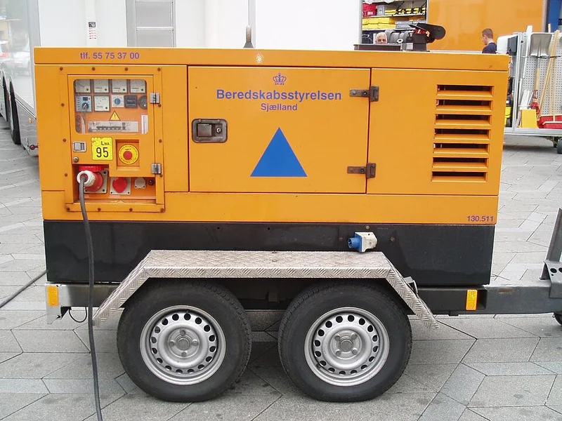
Mobile site generator
Power · Netanya
- ₪480
- / day
- Today
- Availability
- Mobile generator
- Equipment type
Compact company cards
CompanyMark uses distinct fictional logo assets at /companies/logos. CompactCompanyCard shows a logo, name, role, base and one profile action. Used on the home page, company directory and trusted directory. Sponsorship never grants approval; browser-local profiles stay pending.


Four-card map and featured marker
Desktop: four cards in a square on the left and an equally sized street map on the right. Mobile: map first. Selecting a pin opens its results page. All filtered locations stay on the map; featured pins remain yellow. Preserve MapLibre marker classes when reusing elements. Locations are approximate demo pickup areas.
Open map listingsListing review and detail preview
Shared by the final listing step and the saved listing preview. Uploaded photos remain in this tab.
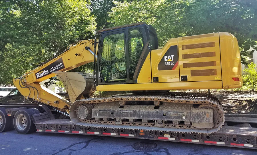
Equipment · Crawler excavators
CAT 320 GC tracked excavator
₪3,450 per day · demo rate
Petah Tikva
Tracked excavator for foundations, trenching and bulk earthworks. The demo listing includes a licensed operator; fuel and site access are confirmed in the quote.
- Service area
- Gush Dan and Central District
- Availability
- Add 3 photos before publishing
- Make / model
- Caterpillar 320 GC
- Year
- 2021
- Specification
- 22.6 t operating weight
- Condition / grade
- Used · service history available
- Delivery / pickup
- Delivery available
- VAT
- VAT excluded
- Minimum
- 1 working day
- Payment
- Demo terms: 20% booking deposit
Terms
Operator included. Fuel, low-loader transport, permits and unusual access requirements are quoted separately.
Paid placements · demo
Featured · Sponsored
3.5 t mini excavator
Ayalon Equipment
Tel Aviv–Jaffa, Gush Dan
₪650 / day

3.5 t mini excavator
Earthmoving · Tel Aviv–Jaffa
- ₪650
- / day
- Today
- Availability
- 3.5 t class
- Operating class
4.5 / 5 · 2 sample company reviews
Request quote
6 t compact excavator
Earthmoving · Petah Tikva
- ₪820
- / day
- Ask provider
- Availability
- 6 t class
- Operating class
Listing photos open the relevant company or item. Standard cards reveal the action after 600ms hover; featured photos reveal it immediately. Keyboard focus and touch always expose the action.
Yellow identifies a sponsored listing. Standard listings stay white. Paid placement does not change verification status.
Equipment media
Category label
Equipment name
Request quote
Commercial model
VerificationService areaAvailability
List rows
Equipment requestRequirement · Service area
Quote receivedProvider name
Dates confirmedBooking period
Status badges
Available todayVerifiedDeliveryFeaturedPending reviewUnavailable
11 · States
Every flow has a clear next move.
Loading, empty, success and error states use direct language and stable layout.
KLIGO page loading
Unchanged master logo and wordmark, with yellow bars filling left to right. Real route fallbacks control the loader; navigation is never delayed. Reduced motion removes the transition.
Loading requests
Keep the current layout stable while request data is prepared.
No saved items yet
Save useful listings so they are easy to compare later.
Could not load results
Explain what failed and give one safe recovery action.
Request sent
Confirm the outcome and point to the next useful screen.
Button states
12 · Overlays
Modal for decisions. Sheet for mobile work.
Overlays open only when requested, keep one dominant action and remain fully usable from the keyboard.
Decision modal
Short confirmation
Use for a focused decision that should not become a new page.
Mobile bottom sheet
Task controls
Use for filters, compact forms and contextual actions on smaller screens.
13 · Mobile
Mobile navigation
Home, Saved, Create, Messages and Profile stay at the bottom below 768px. The current page is black with yellow text; Create keeps its yellow accent. Notifications and the menu stay in a compact top bar.
One product, real screens
The responsive website is the working reference. Use the links below on a phone to review the actual flows. A native iOS and Android application is still to be built; these downloads contain web source and the app handoff guide.
Shared bottom navigation
Every tab opens its real screen. Provider mode changes the Messages and Profile destinations. On phones, these tabs stay at the bottom with safe-area spacing.
Customer journey
Account and help
Reuse the approved logo, tokens and interaction rules. Web components use browser APIs and need native equivalents in the app. The guide maps reusable code, production services and release checks; the website ZIP includes the complete reference implementation.
Reuse MobileAppNavigation and MobileTopBar. Account shortcuts expose Plans, billing, settings and support from Profile. Provider routes use company profile and provider messages. Authentication screens omit product tabs. Allow for the phone safe area; hide fixed tabs when the software keyboard reduces the viewport, and keep overlays above navigation. Profile sections preserve draft state when switched.
14 · Handoff
Assets and rules the developer can take.
The source repository remains authoritative; these direct downloads make the approved visual foundation easy to inspect and reuse.
Implementation map
Logo component, button component and global tokens are the reusable source of truth.
- Buttons
- components/kligo/button.tsx
- Logos
- components/kligo/logo.tsx
- Tokens
- app/globals.css
Component manifest
Machine-readable names, fixed dimensions, brand values and shared component inventory.
Download JSONThe public homepage and login entry now reuse this system.
View homepage